Energy Mix
Draw your own conclusions from these charts

I stumbled across some interactive energy charts at Our World in Data and thought I’d share a few that I found most interesting or thought provoking. Whilst the static images below are useful, I’d encourage you to click the link as the charts truly are interactive.
I’m not going to give you a whole load of words here, just a couple of takeaways and then the static charts.
We are using more renewables globally
And their proportion of the overall energy mix increasing
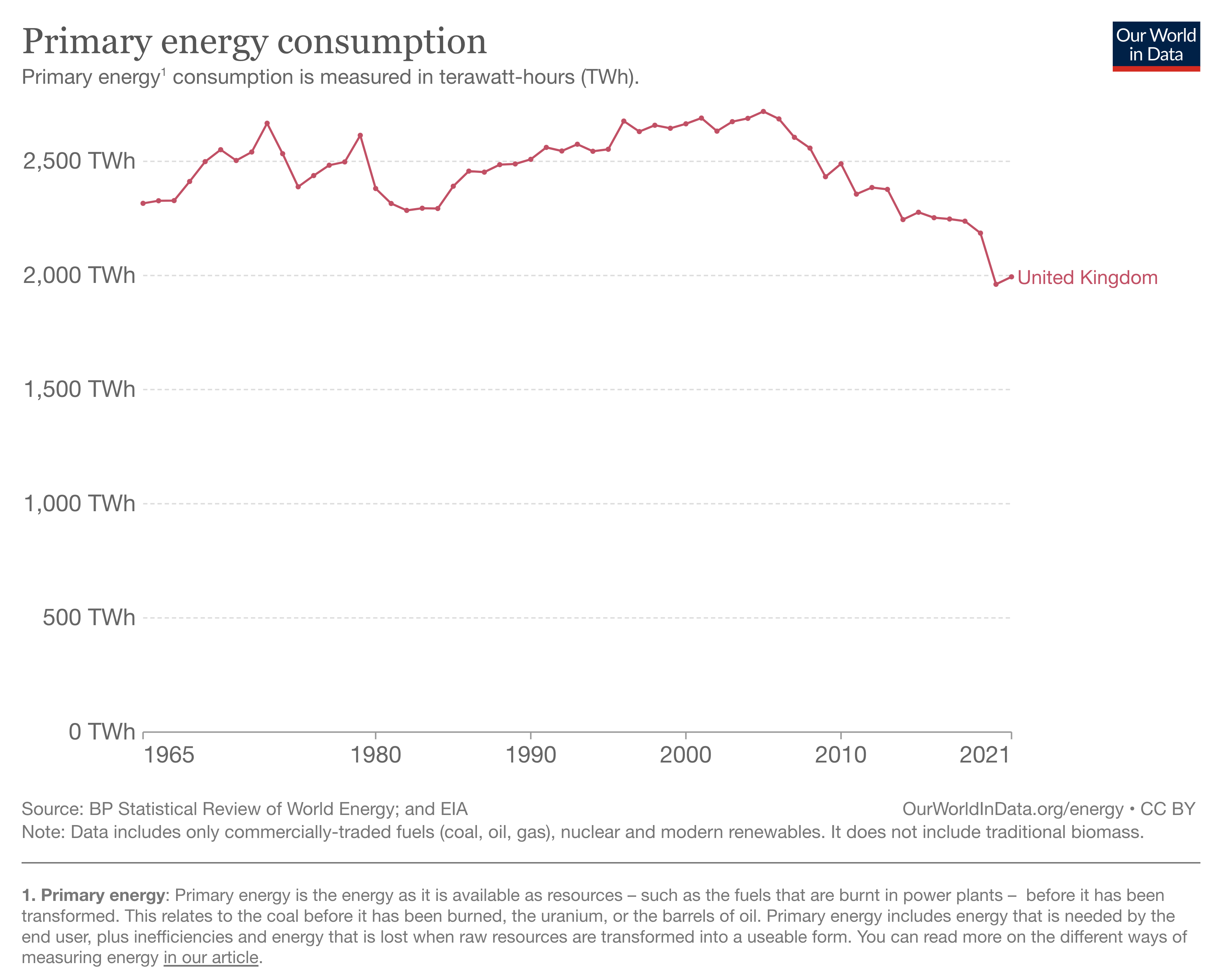
However we still use more and more energy globally each year (UK is reducing)
Resulting in the total global amount of annual fossil fuel use continuing to rise
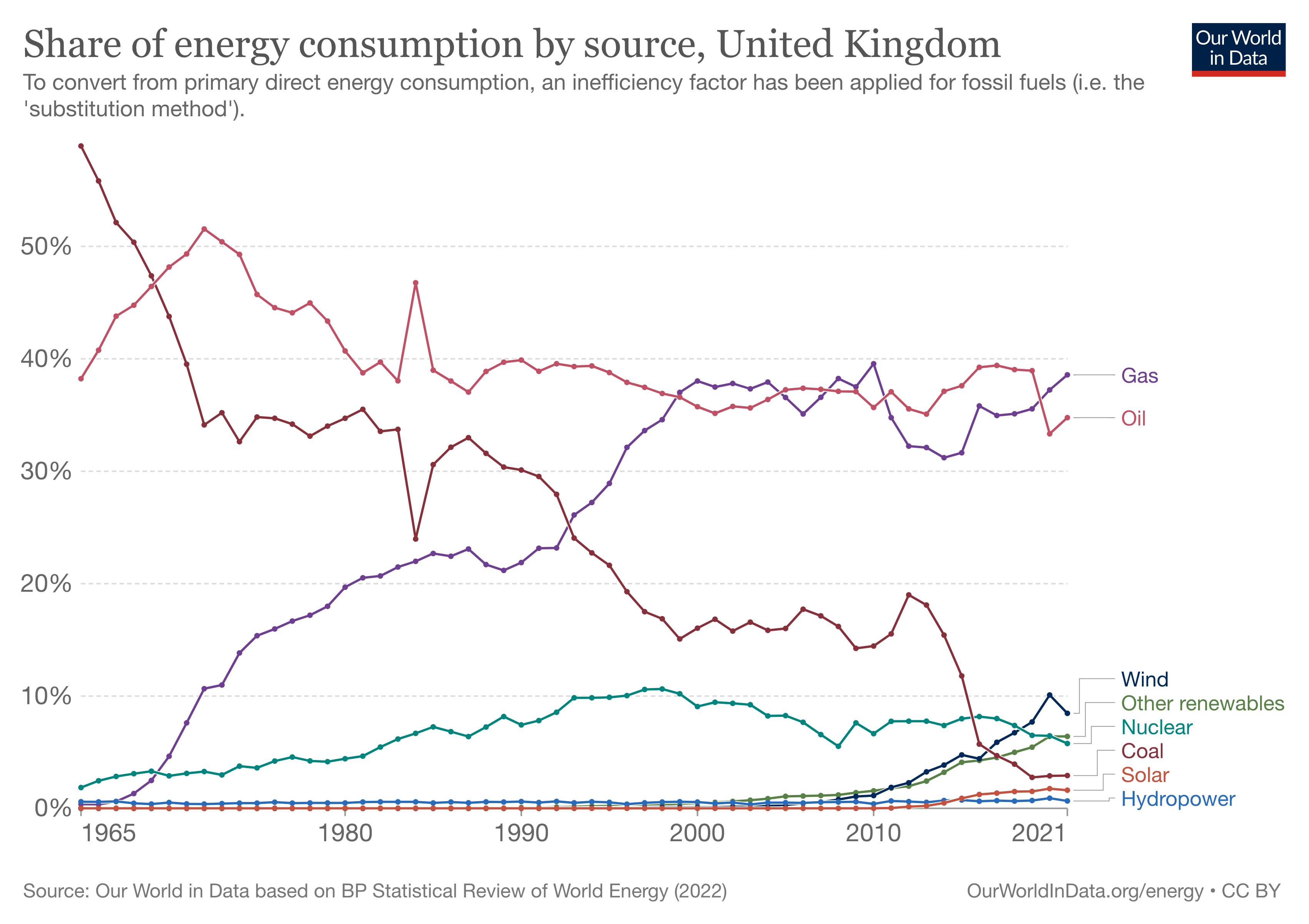
The UK is not leading the way with it’s use of low carbon sourced electricity, but it is better than many
In the UK, our energy intensity is reducing
Safer energy seems to also mean clean energy
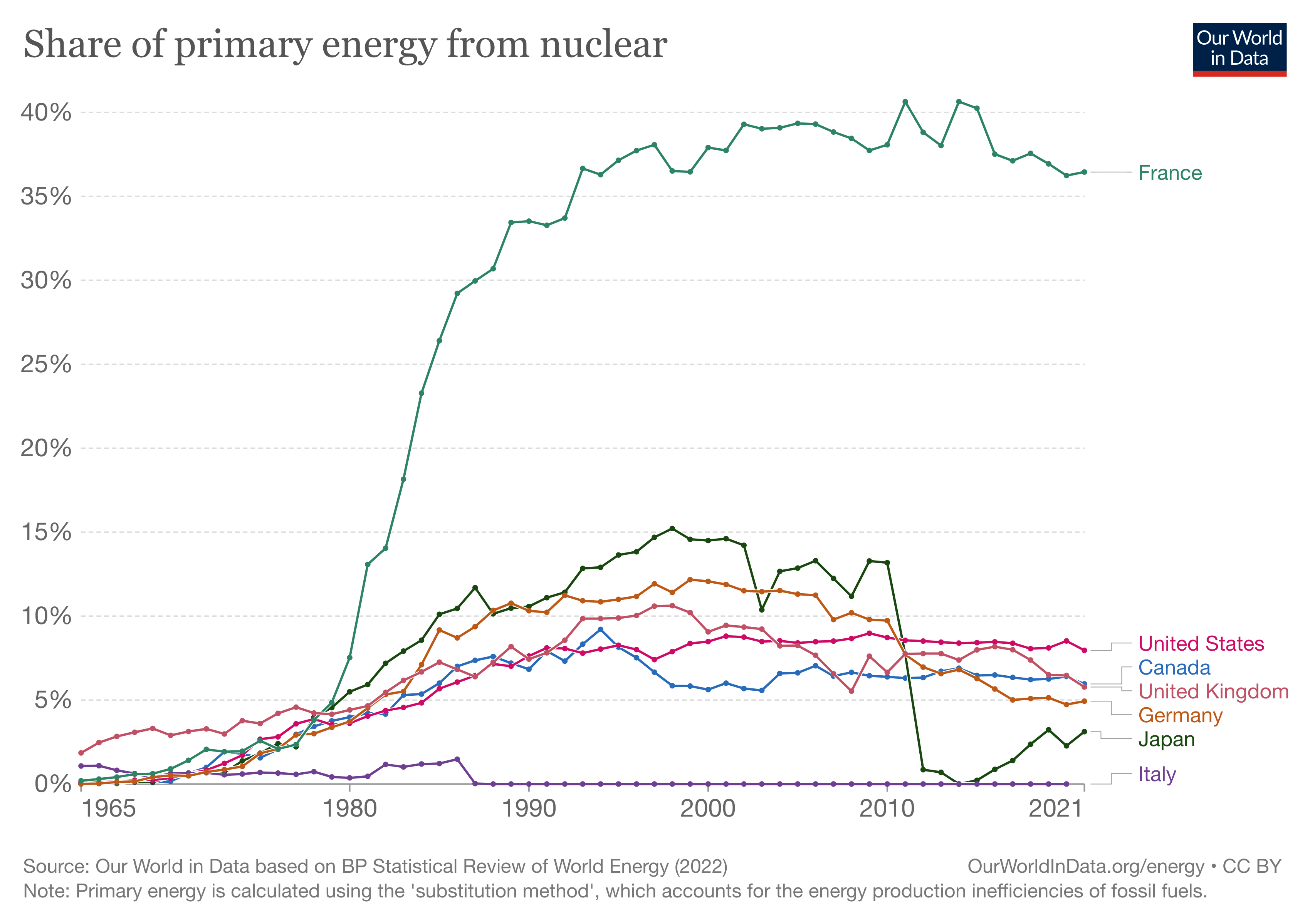
But despite nuclear being safe and clean, our use of it is declining in the UK and globally it is the same now as it was twenty years ago